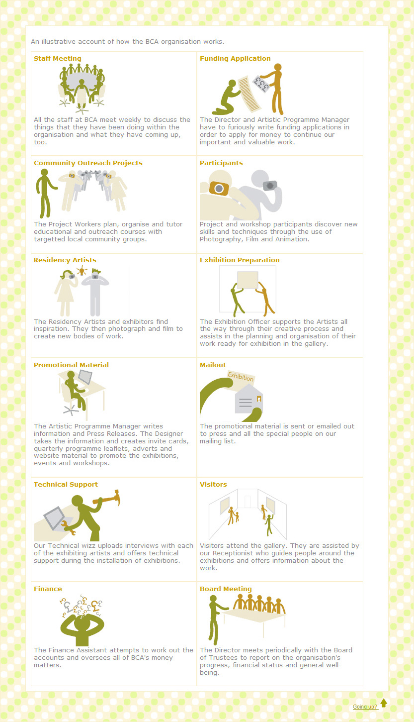
For nearly 10 years I worked at an organisation called Bedford Creative Arts (shortened to BCA). In 2007, I was set the task of completely redesigning the BCA brand.
In the idea generation process it became clear that a more friendly, approachable design was key to the organisation. Therefore the logo was rounded instead of square, the BCA became lowercase and to clarify what those initials stood for the words Bedford Creative Arts joined them on the main logo.
The BCA Gallery, which before that had its own identity and branding, became an additional label that was added to the logo.
I created a new typeface, despite not having any experience of making a new font before. It was then used as standard by the organisation.
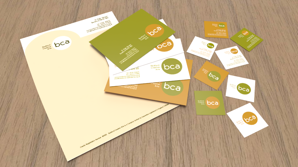
Once the final logo had been established, every aspect of BCA branding needed to change. That meant the creation of new letterhead, compliment slips, postcards, business cards, letter templates and forms, signage, promotional print and branding guidelines to ensure consistency.
Another huge overhaul was to the organisation's website, which I also had complete responsibility over (having already created the two previous versions that came before it).
In the idea generation process it became clear that a more friendly, approachable design was key to the organisation. Therefore the logo was rounded instead of square, the BCA became lowercase and to clarify what those initials stood for the words Bedford Creative Arts joined them on the main logo.
The BCA Gallery, which before that had its own identity and branding, became an additional label that was added to the logo.
I created a new typeface, despite not having any experience of making a new font before. It was then used as standard by the organisation.
Once the final logo had been established, every aspect of BCA branding needed to change. That meant the creation of new letterhead, compliment slips, postcards, business cards, letter templates and forms, signage, promotional print and branding guidelines to ensure consistency.
Another huge overhaul was to the organisation's website, which I also had complete responsibility over (having already created the two previous versions that came before it).